Chesapeake, VA
For this project, we had the privilege of working with a client we had previously worked with over a decade ago. It is always a pleasure to reconnect with past clients and know that they are still enjoying the effects of our work in their everyday lives. At that time, we did a full remodel of both their master bathroom and hall bathroom, but now they were ready to update their kitchen, powder room, and laundry closet. Our clients, a couple with a keen eye for design and a passion for collecting local art pieces, were looking to revamp their dated spaces to not only improve functionality, but to brighten up the entire home.
Before:
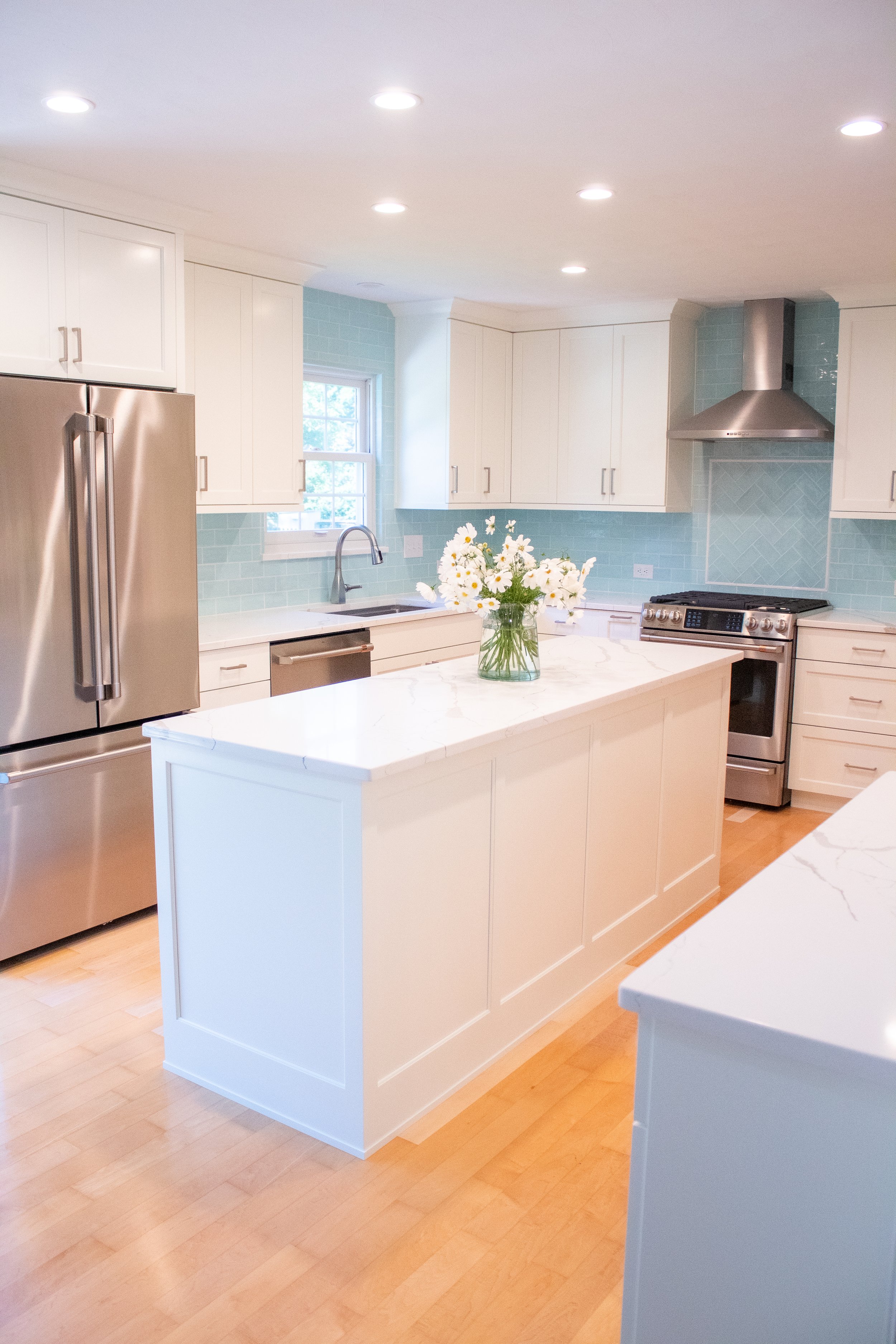
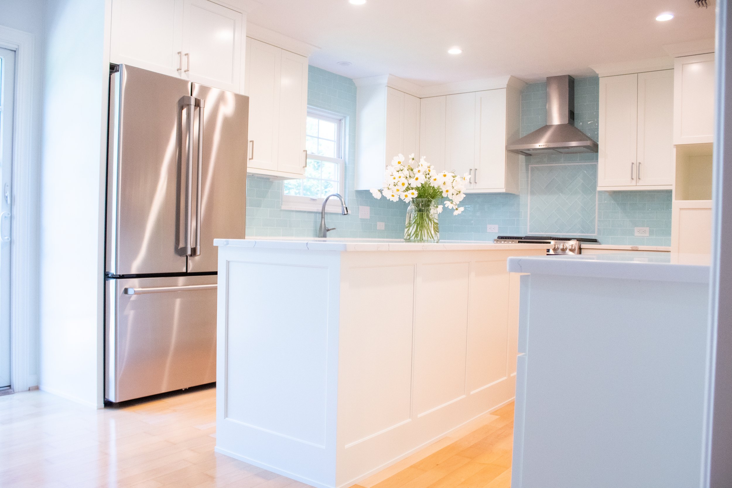
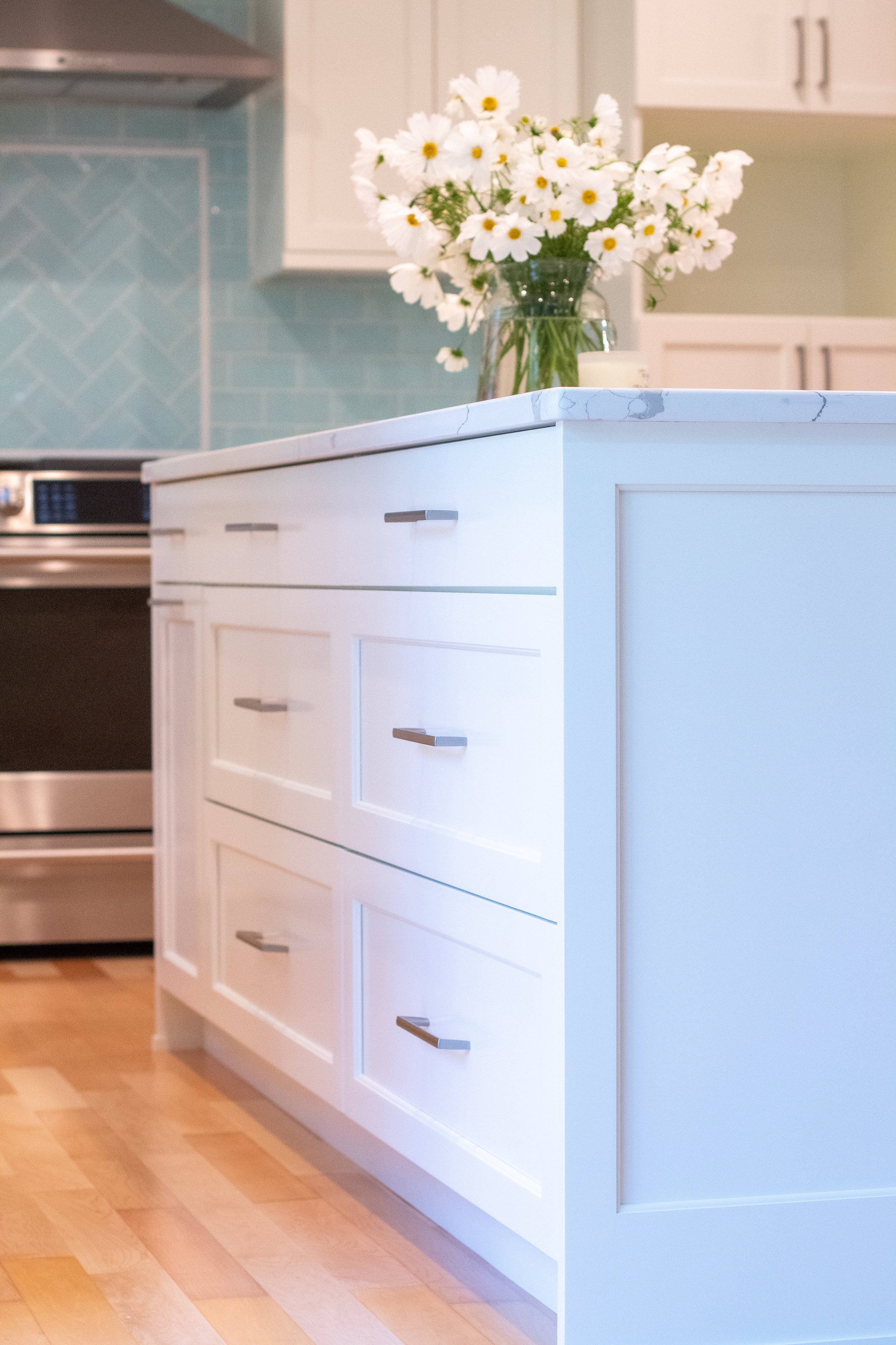
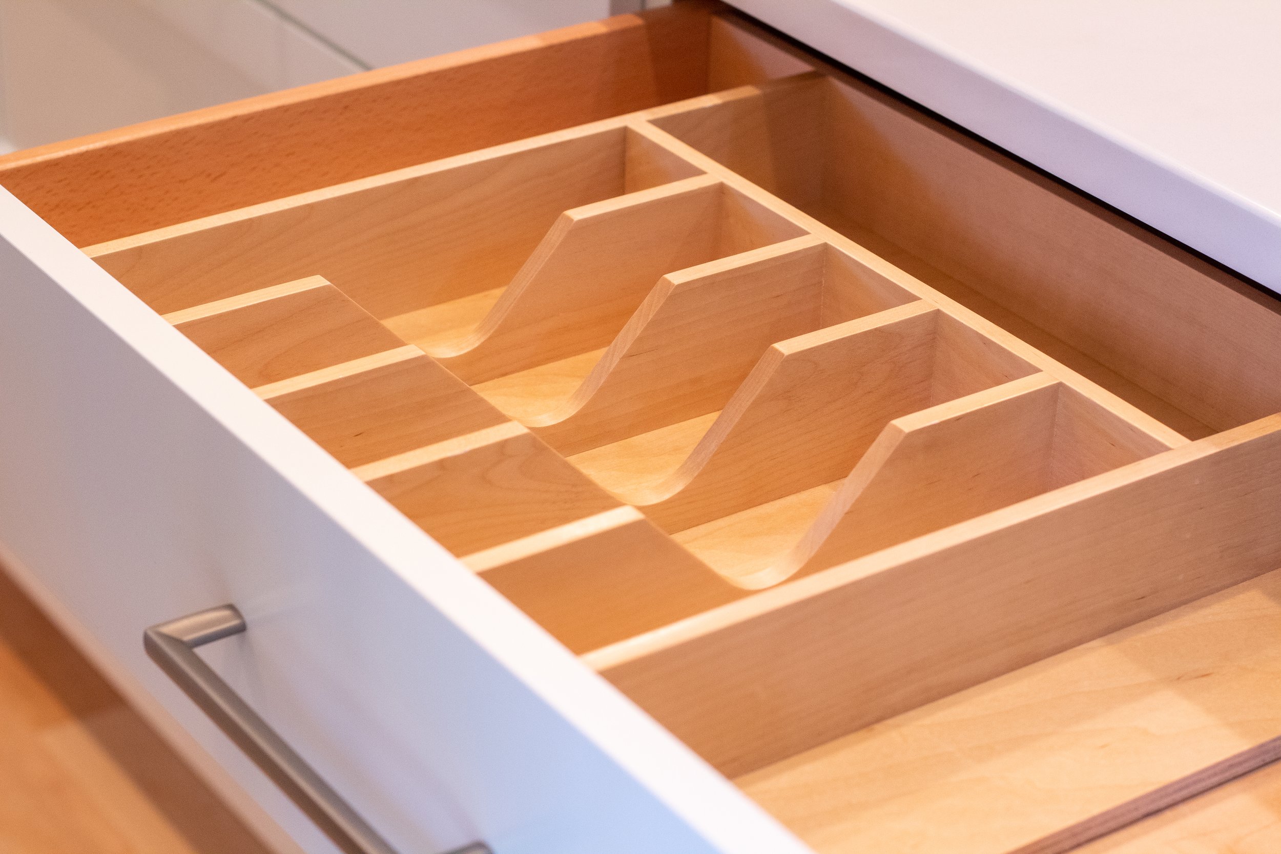
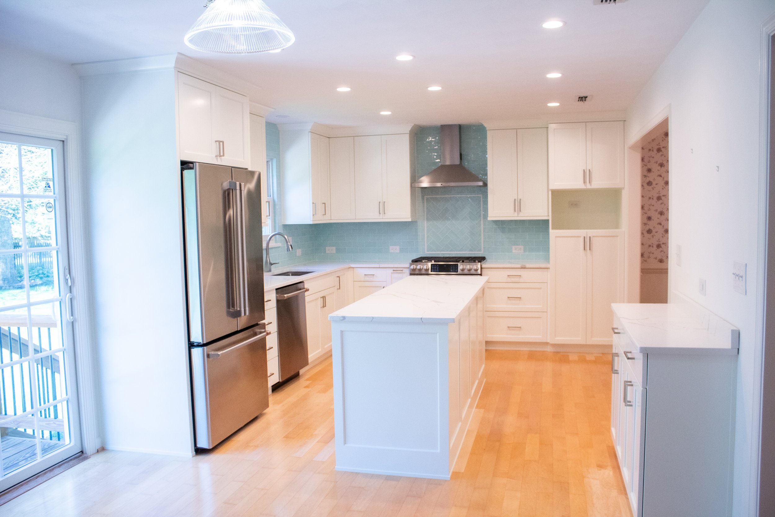
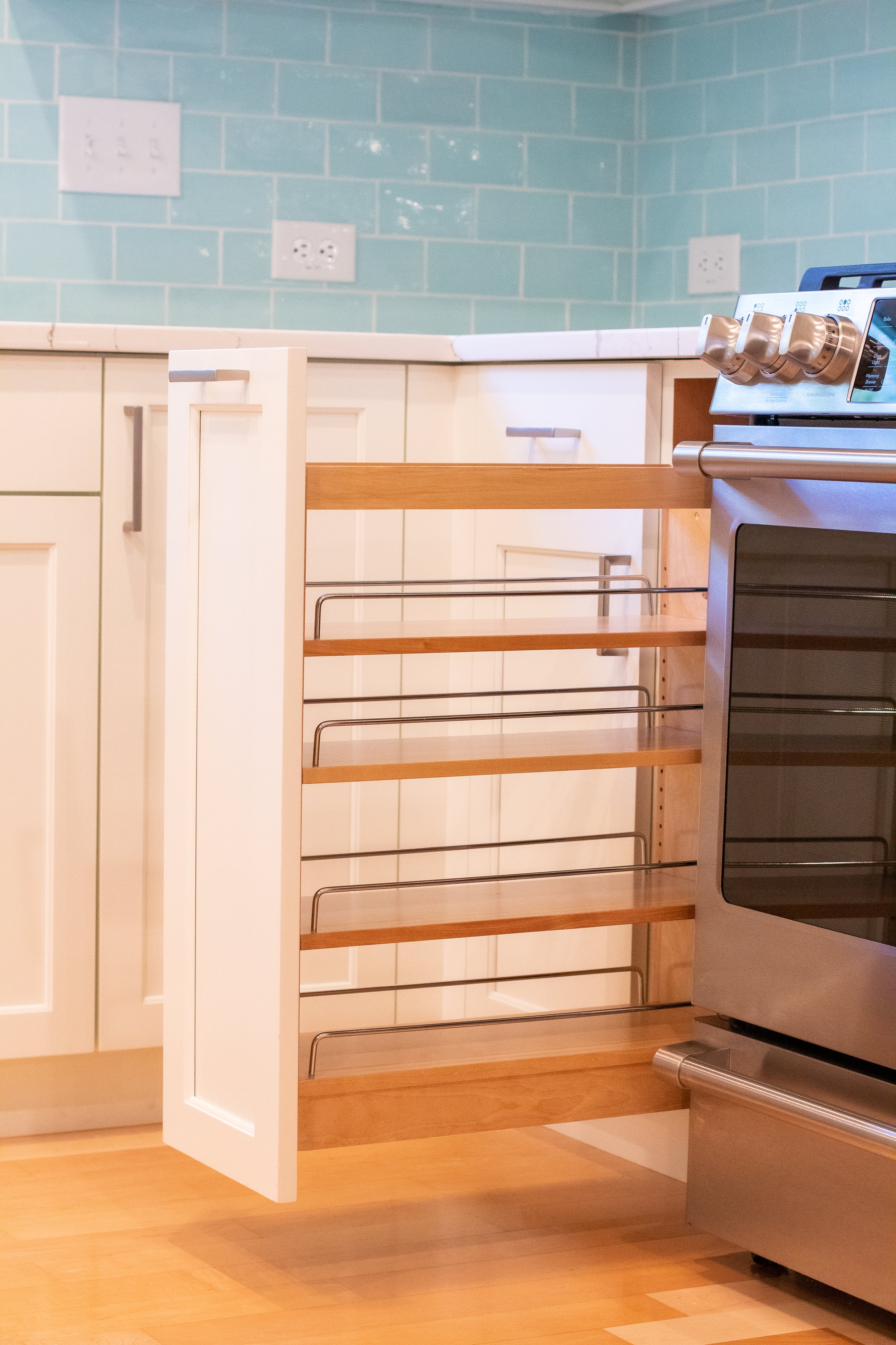
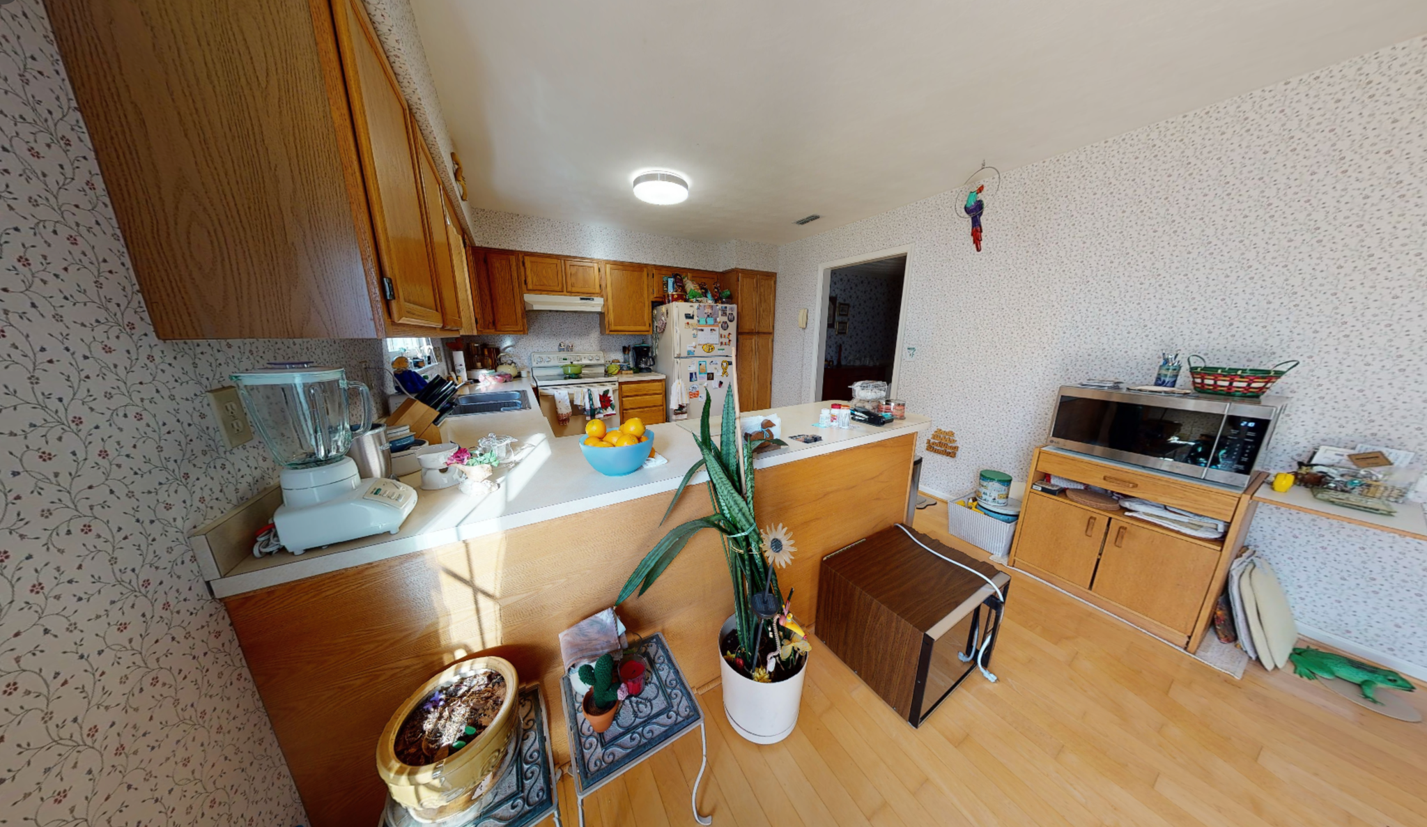
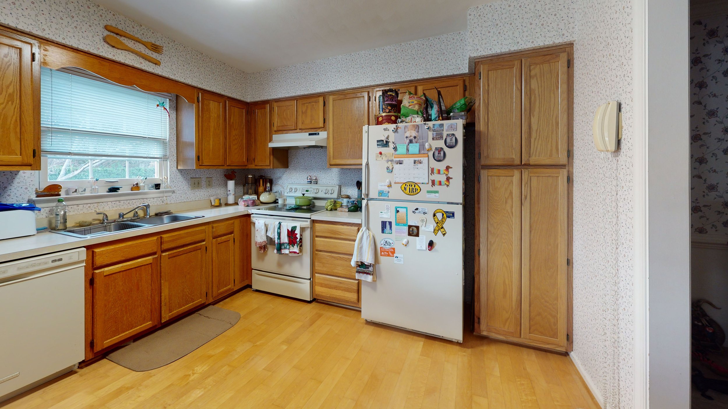
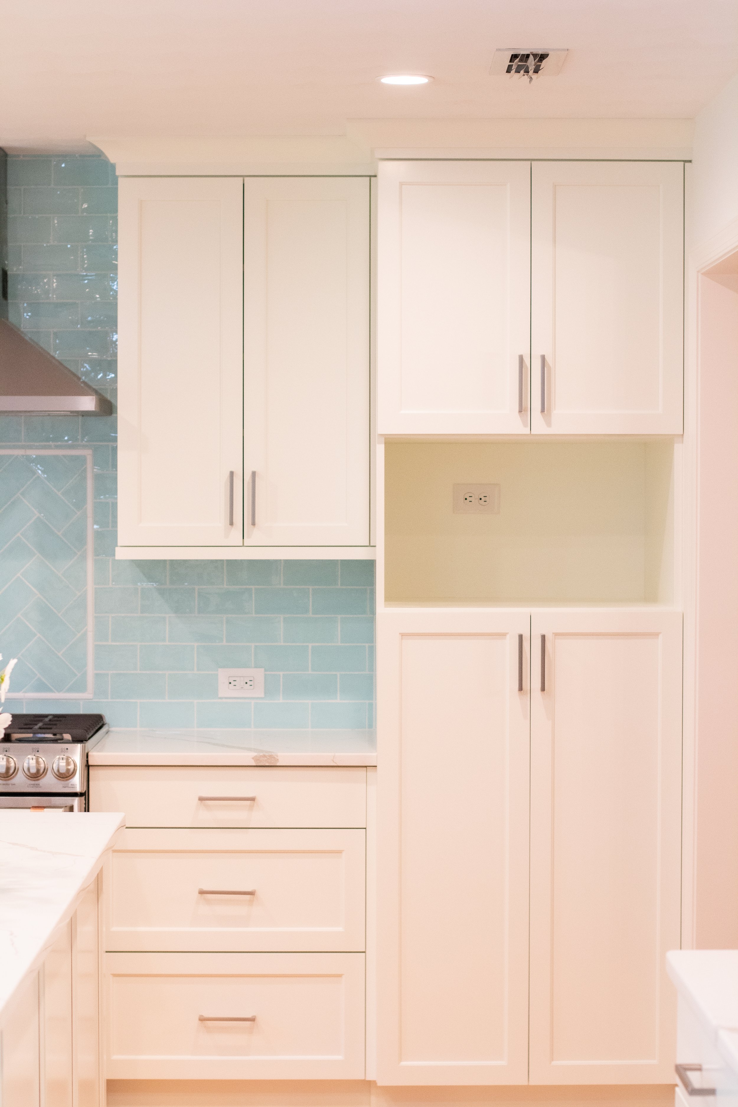
The kitchen was initially a tight space that didn't allow for more than one person at a time. Our team devised a plan to breathe new life into the space and make it more practical and usable. By removing the kitchen peninsula and transforming it into a spacious island, we immediately opened up the area and removed unnecessary “pinch points” for more accessibility. Additionally, the decorative railing separating the kitchen from the family room was removed, and the doorway between the kitchen and dining room was widened from 30 inches to a much more generous 48 inches. These changes not only increased flow but also allowed natural light to flood the space, creating a more welcoming and airy atmosphere. Additional storage solutions and a dedicated bar area were introduced, providing both functionality and the perfect space to showcase the clients’ impressive whiskey collection.
3D Renderings:
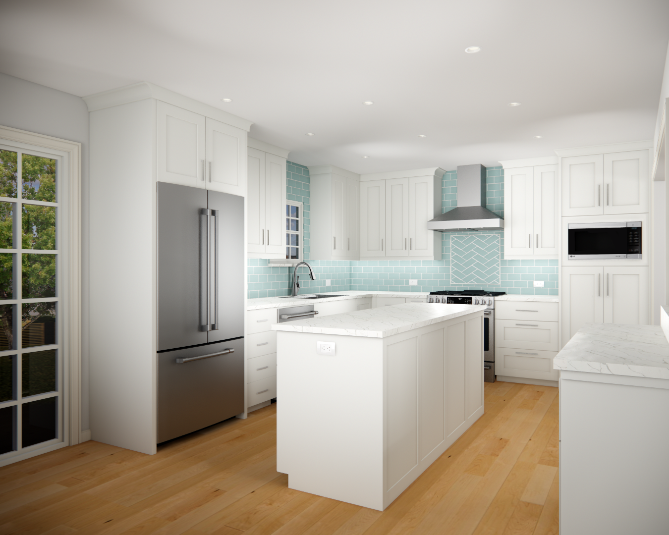
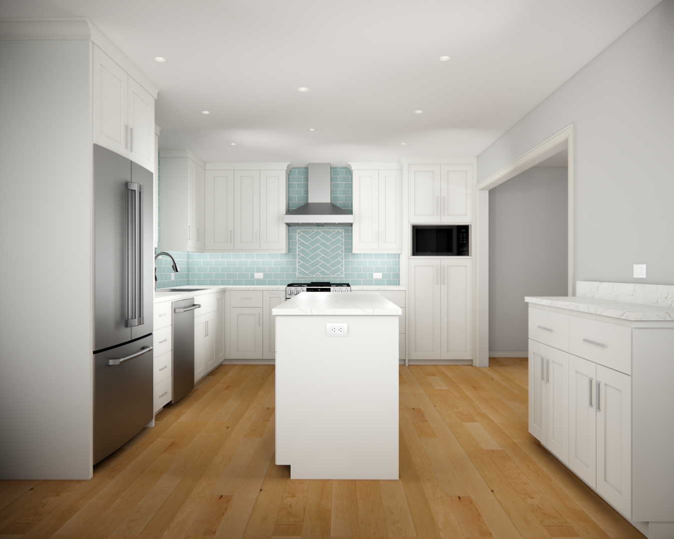
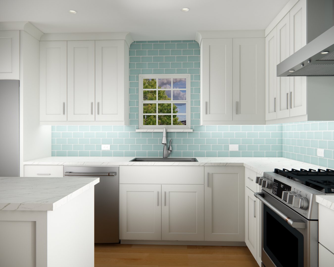
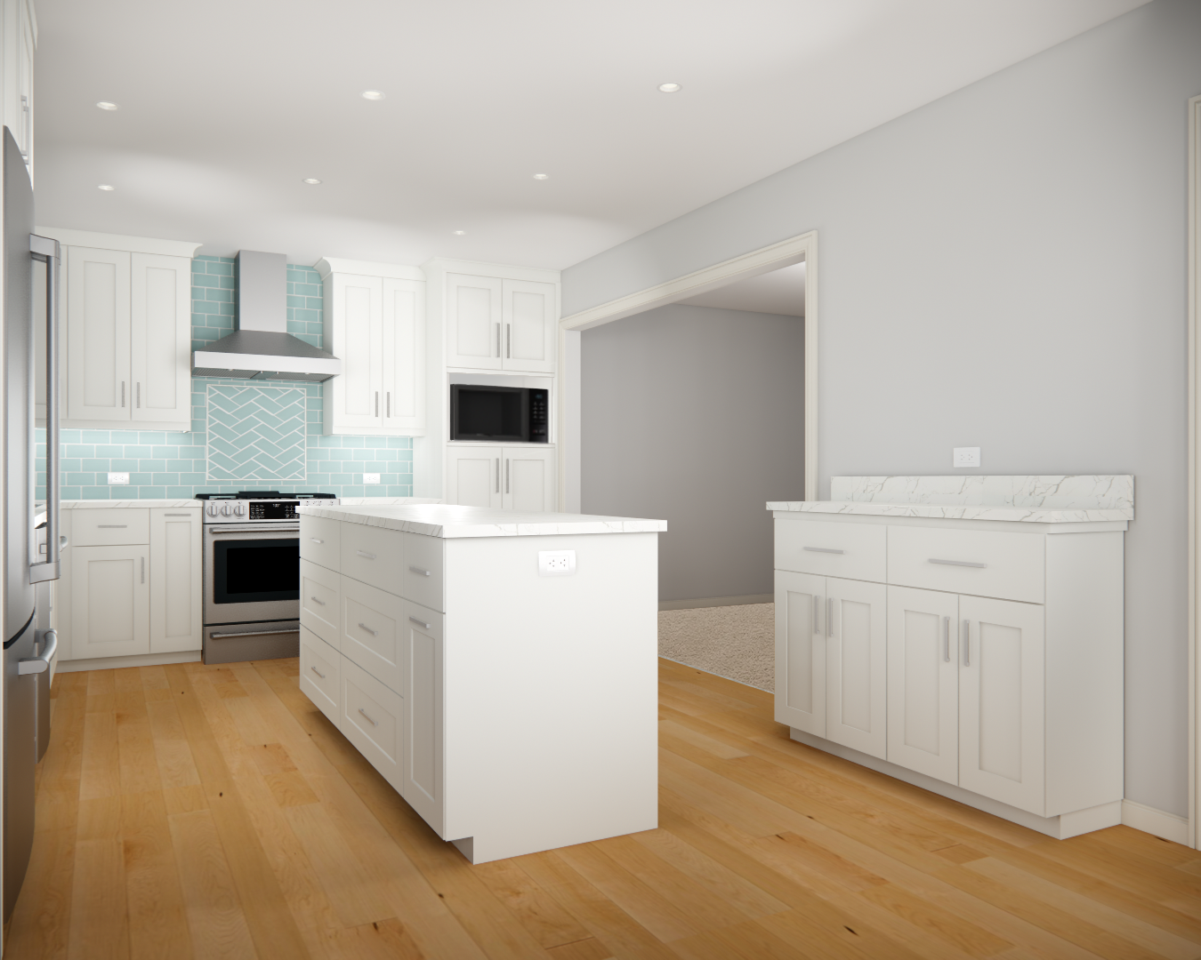
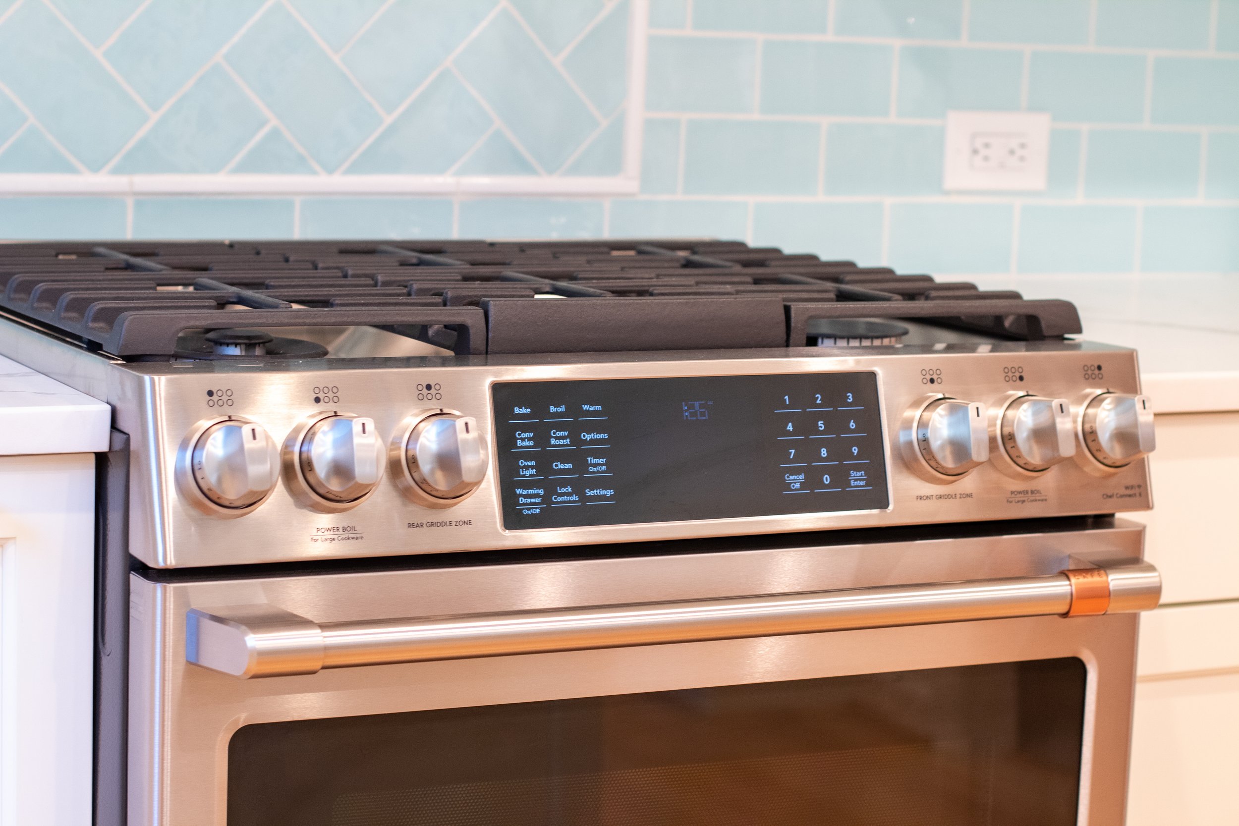
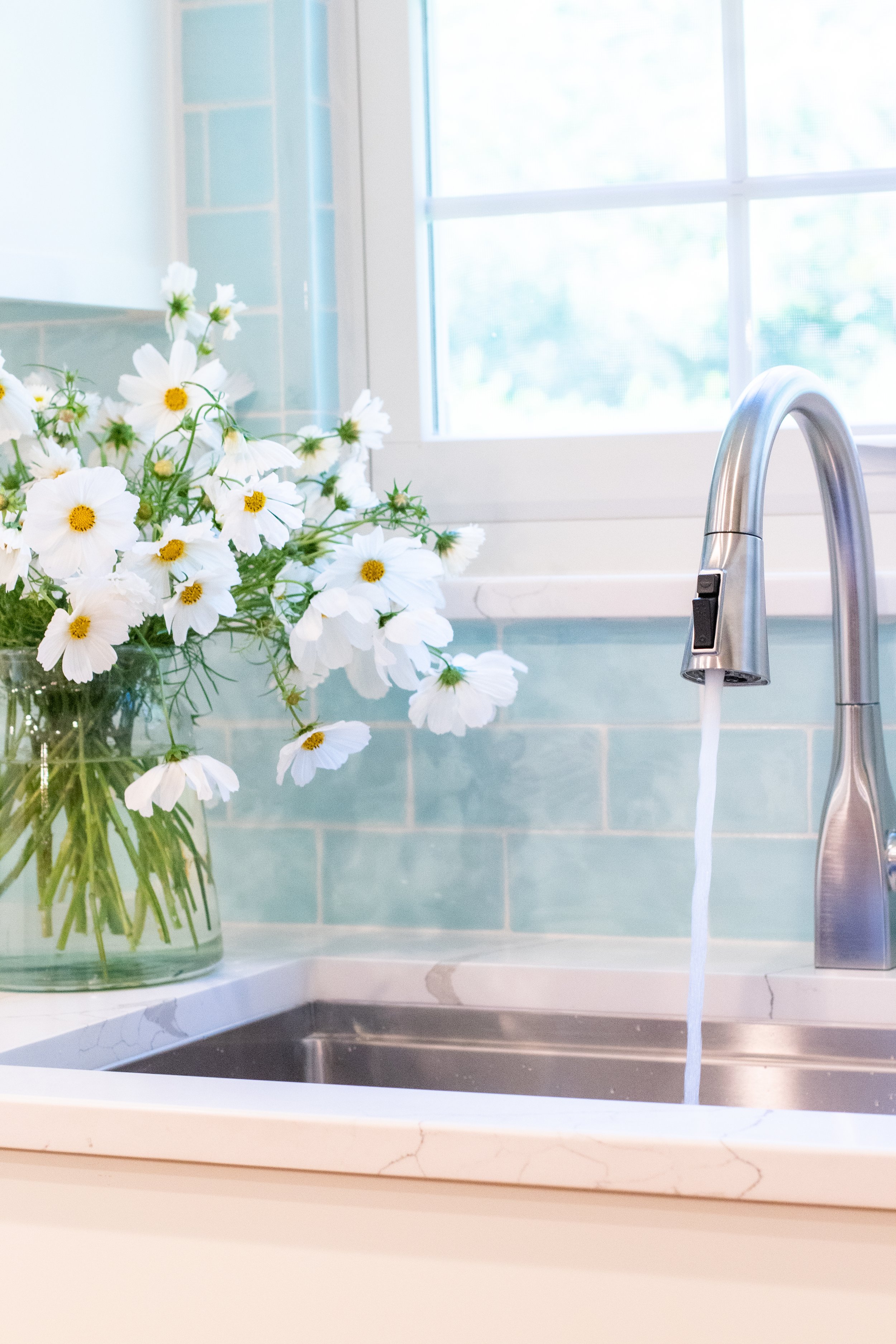
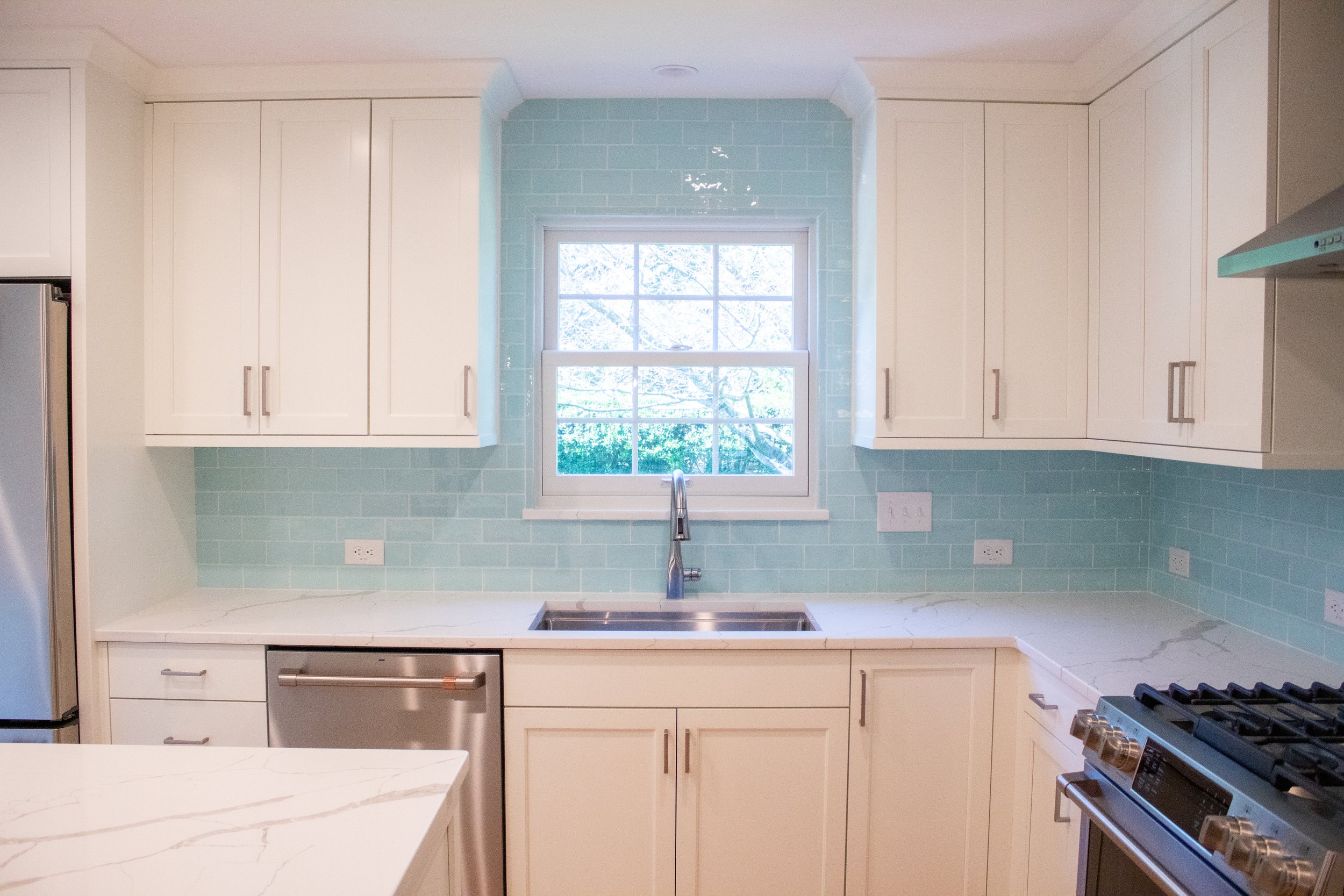
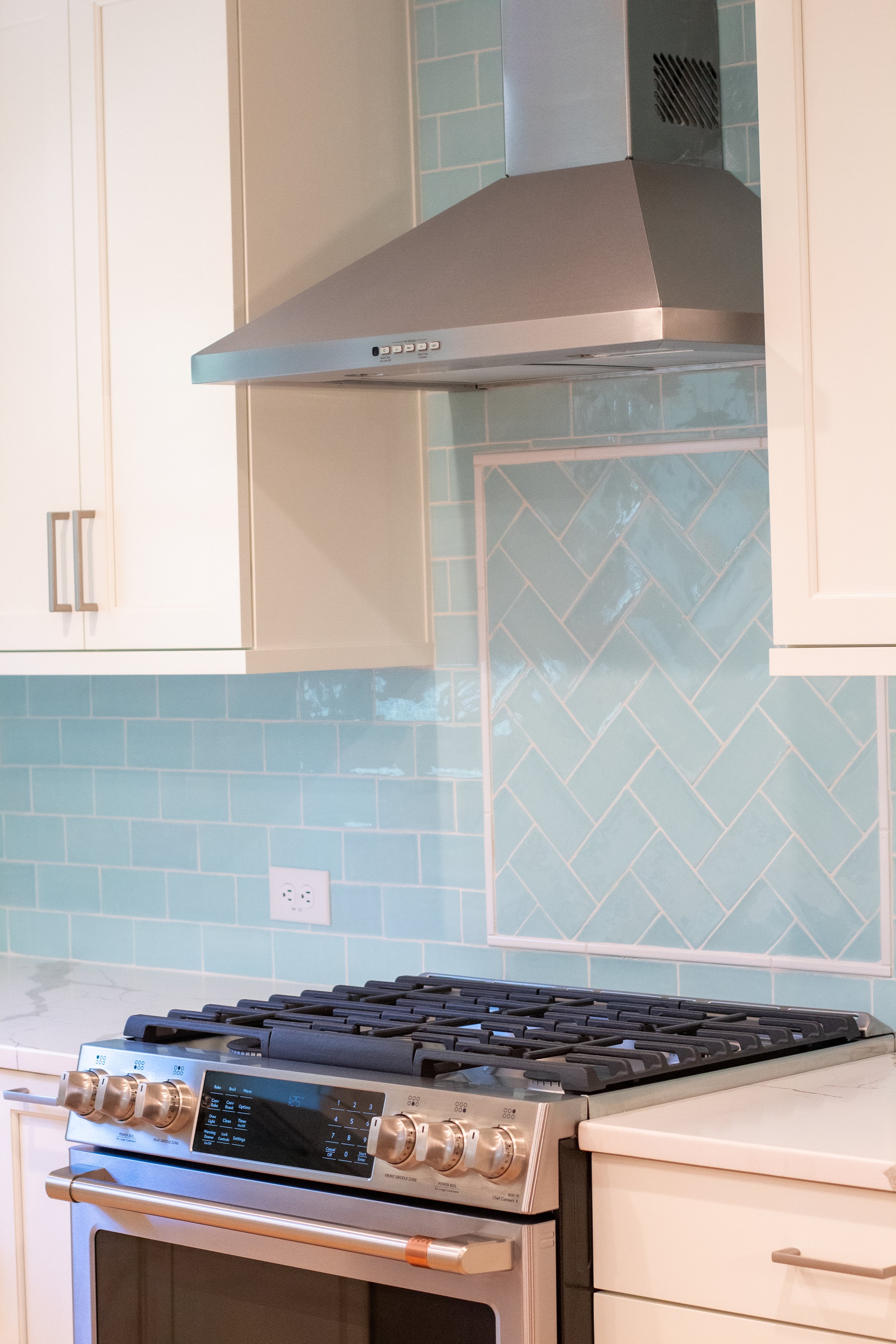
One of the most exciting aspects was the unique collaboration between the couple's preferences. While one of them was initially leaning towards an all-white kitchen, the other was hoping to incorporate a few meaningful pops of color - so we found a happy medium. Drawing inspiration from their shared love for art, we helped them select a striking aquamarine tile for the backsplash in a wavy, shiny finish and introduced a herringbone pattern above the range. These color and style choices ended up being the perfect match for one of their home’s existing art pieces that they were able to move into the kitchen, seamlessly integrating their cherished collection into the heart of their home.
After:
![cabinet].jpg](https://images.squarespace-cdn.com/content/v1/5ccc5517071c020001434af5/1701194314346-V8006RQO7UFHFG3M838T/cabinet%5D.jpg)
